Hello TC
I think the picture is perfectly fine.

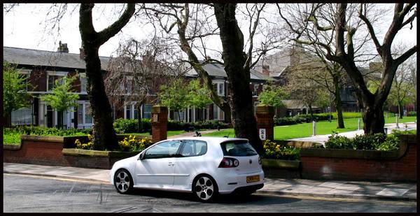
In this case having the car in the middle of the pic seems to have worked quite well else the tree's etc would have been too much of a distraction and we dont want that.
Also... You really should try that method I explained a few weeks ago. Where you focus on the car. Then move away and then take the picture... If you look at the car you will see the front of the car is slightly blurred. This is because of the Auto focus. Auto Focus will focus (95% of the time) on what is closest to the camera. Because the car is at an angle it focuses on the boot and you get over exposure on the bonnet or blurry front rims. This is even more apparent when taking pics of white cars as the reflections on the paint are that much more vivid. By focusing on the car first the camera will compensate for the extra light and fix the reflection and blurry wheels...
I quite like how you had the car in between the trees... This is nice cos it draws your eyes from the tree's down to the car.
Below I have posted a slightly edited version of your pic. Heres what I did:
1. Your car is white which gives a really nice chance to make the pictures dramatic. Saturate the greens, and browns so that your car stands out that much more.
2. Enhance the whites... Makes it a little more blinding...
3. Then do some cropping. Your pic has a lot of dead space at the top (with lots of white sky white once again distracts from your car) Just crop a bit off the top...
4. Sharpen the pic slightly. Dont do too much as you will end up pixelating a really good pic.
5. Formality.... Borders make a huge difference. Even just for your own personal viewing.... But if posting on the forum it really looks good with a border.
Heres my version of your pic:

I hope you like?
Obviously we all have our own styles and our own likes... Thats just how I feel the picture should look. I love the dramatic effect

Mike